Farmacy Food
2021
Branding
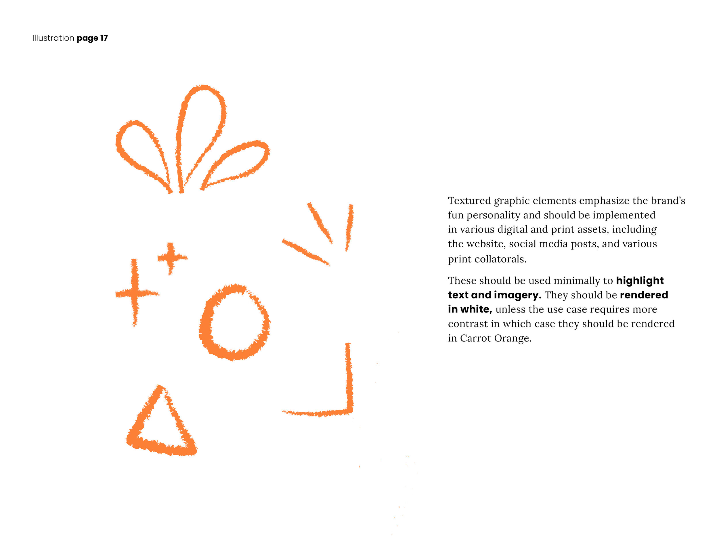
Illustration
Web Design
Visual and verbal branding for Detroit-based food startup Farmacy Food.
Who? Farmacy Food is a meal delivery service located in Detroit focused on serving the community and helping people live their best lives. They embrace the idea of “let food be thy medicine” by using ingredients with proven health benefits. They aim to be a trusted health partner, tailoring their services to the needs of the individual customer, and forming intimate relationships with those they serve. I worked with three other designers on this semester-long project to redefine their visual brand language.
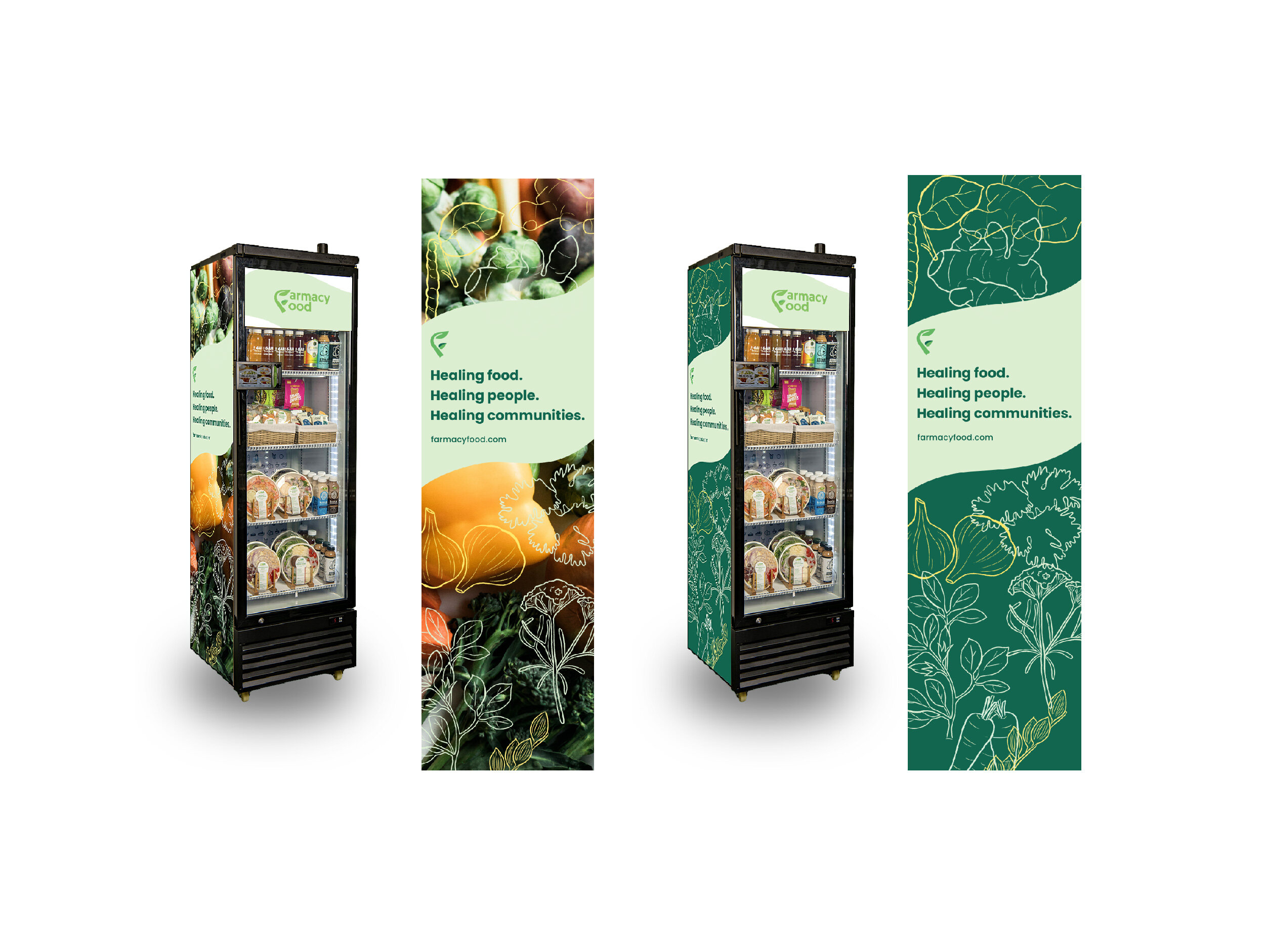
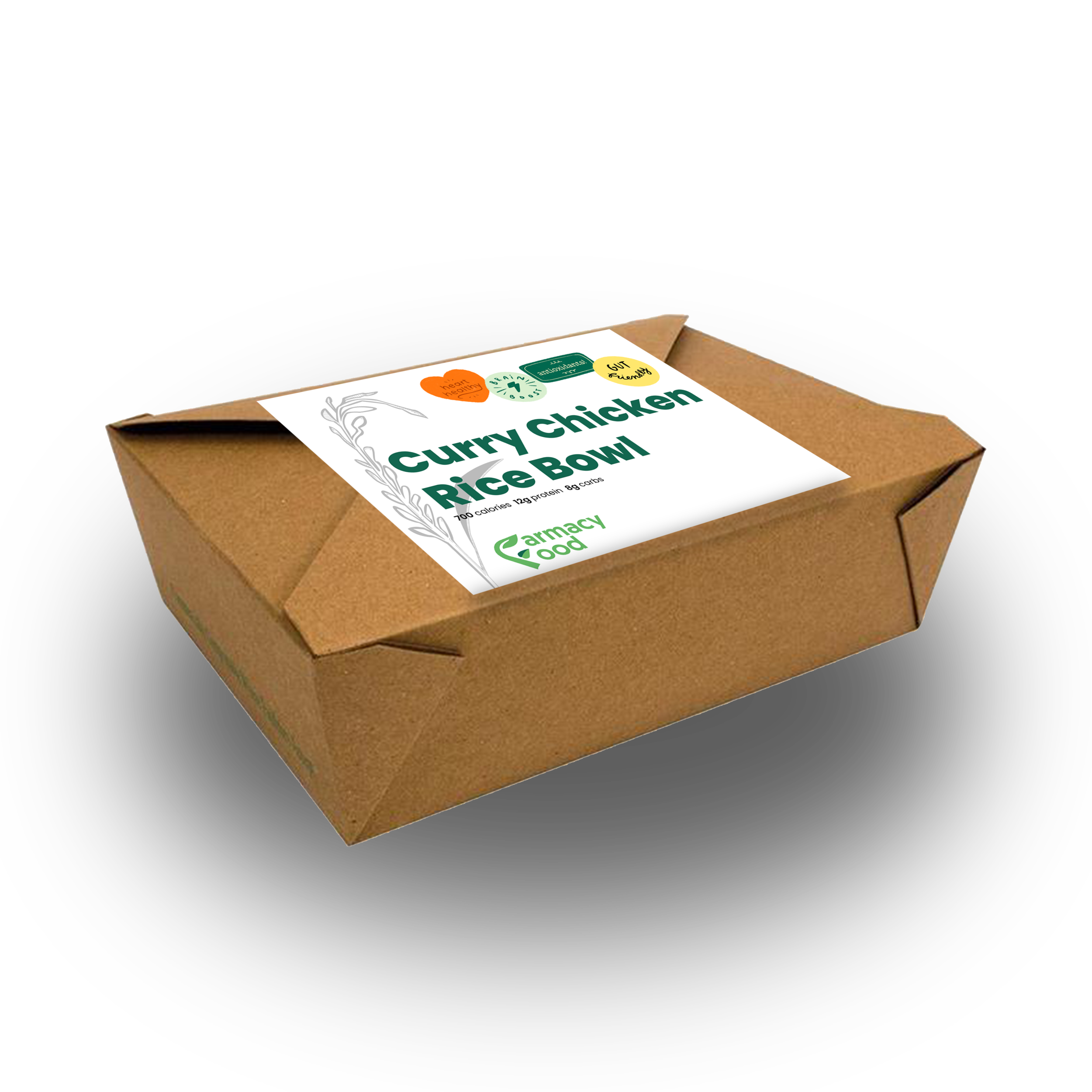
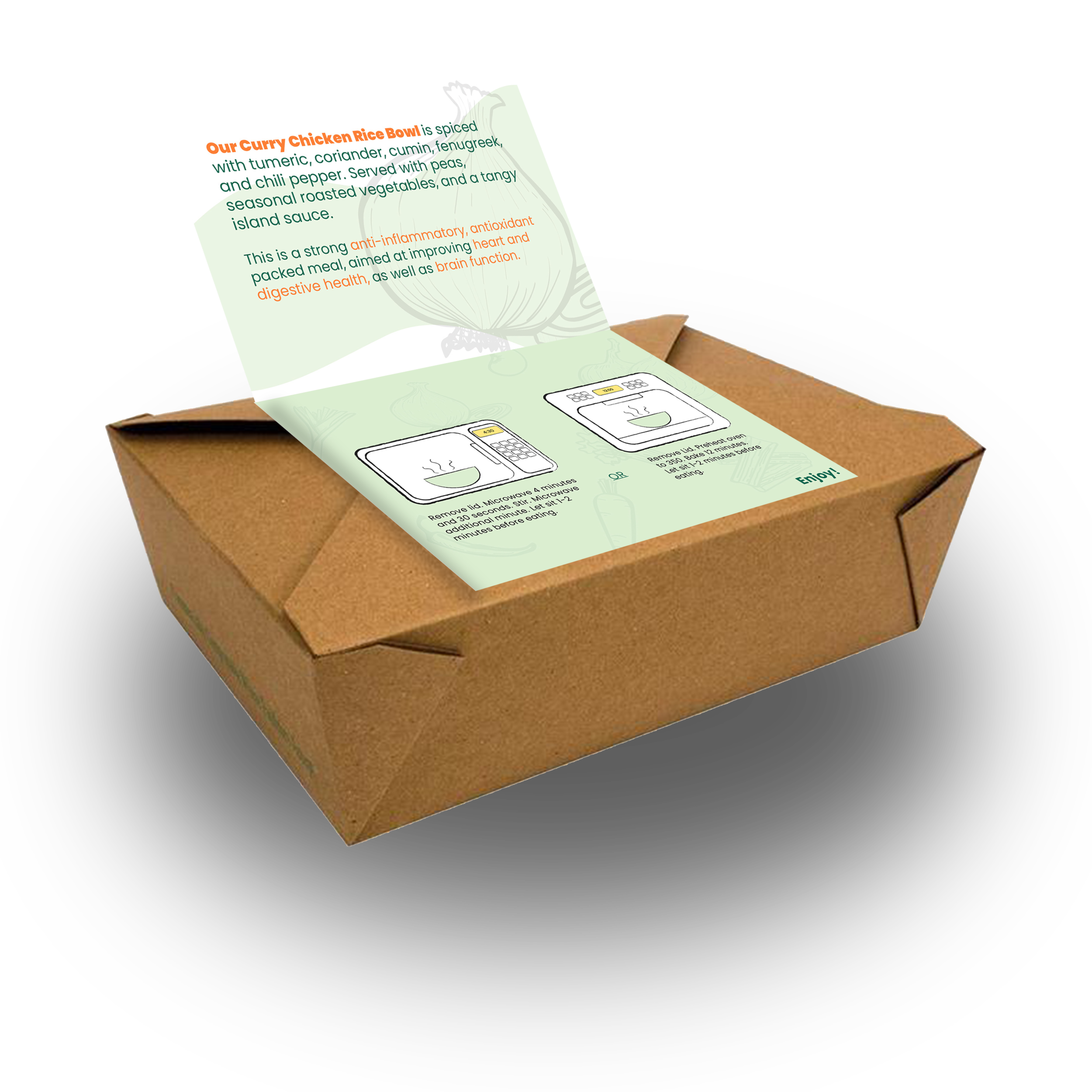
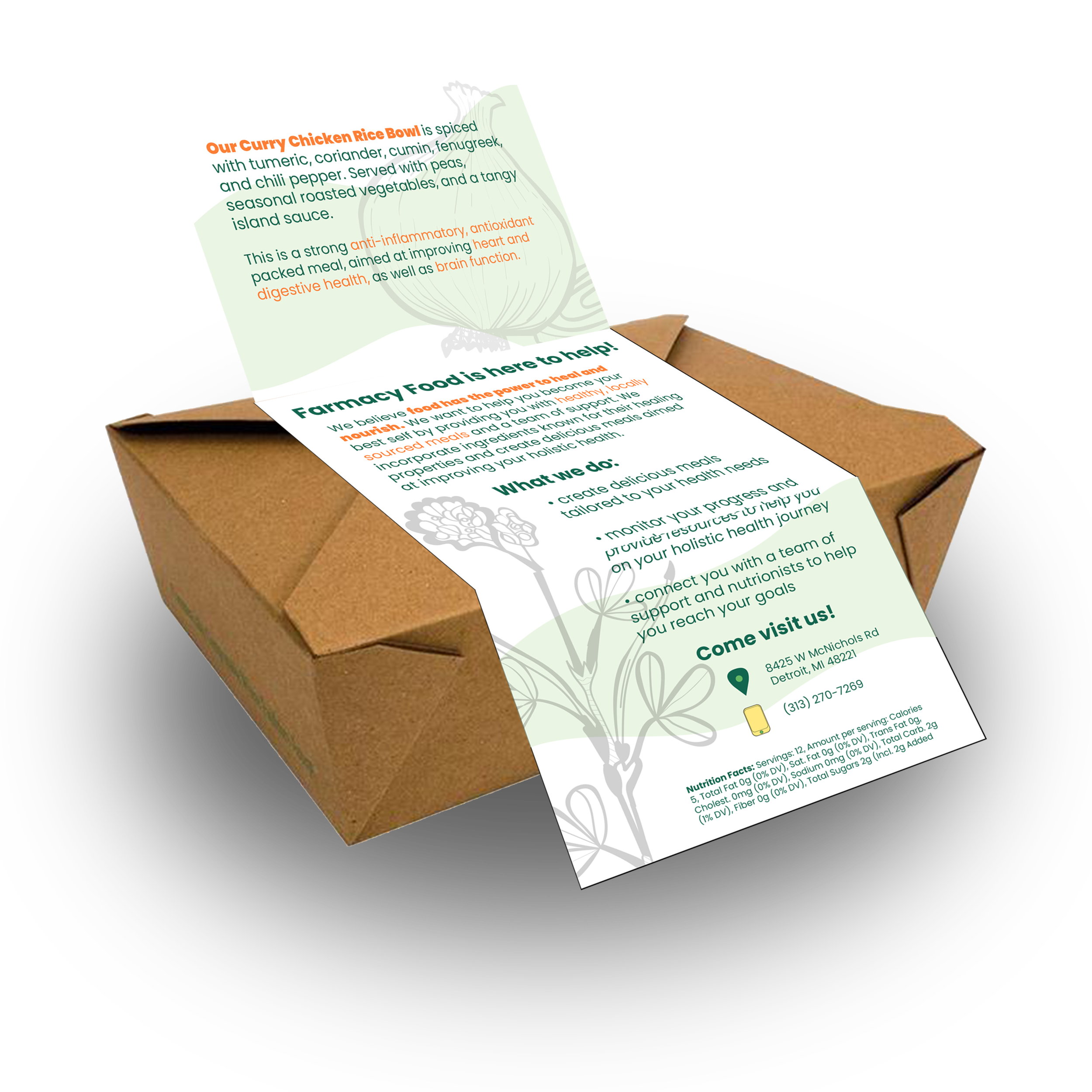
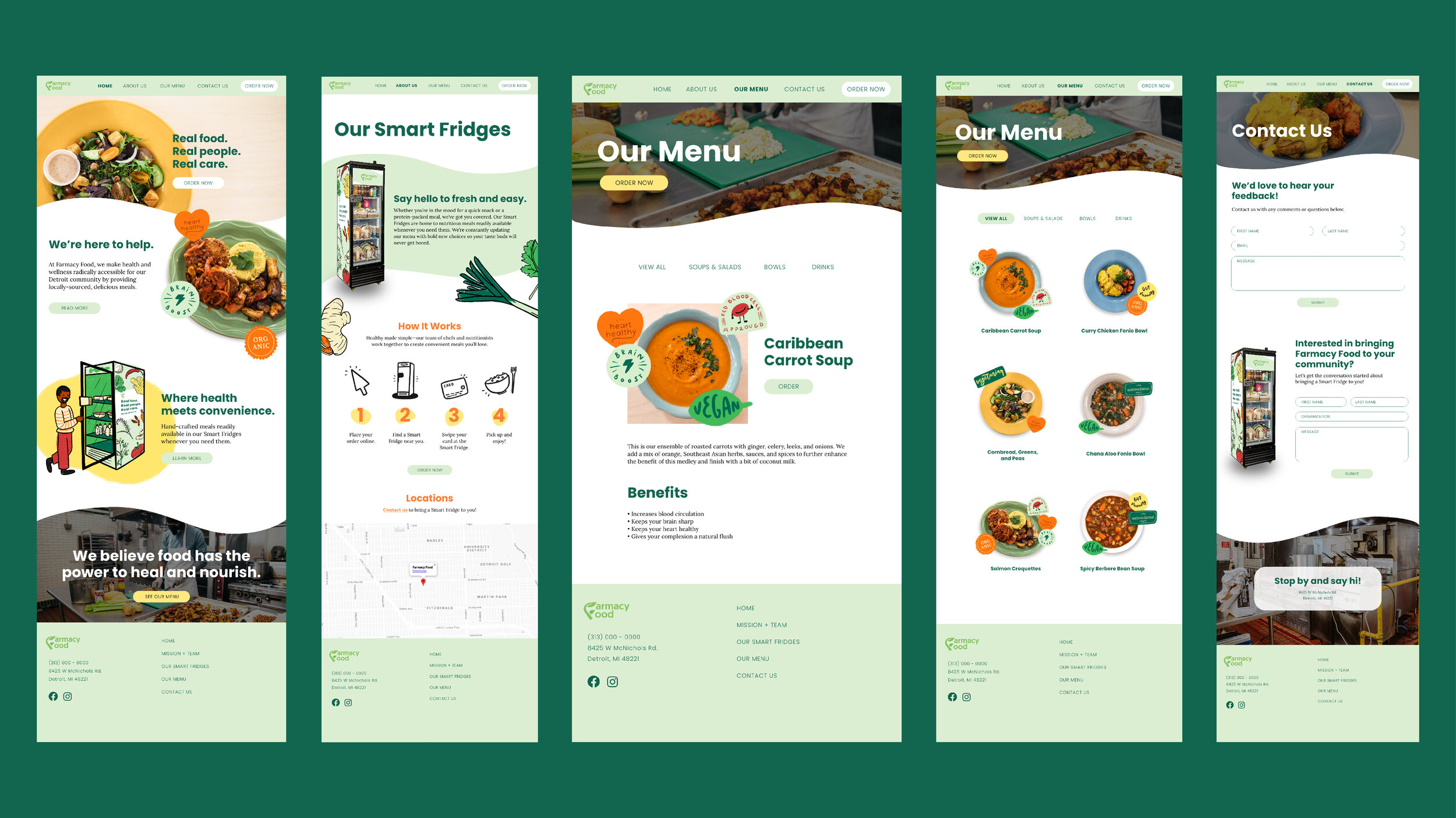
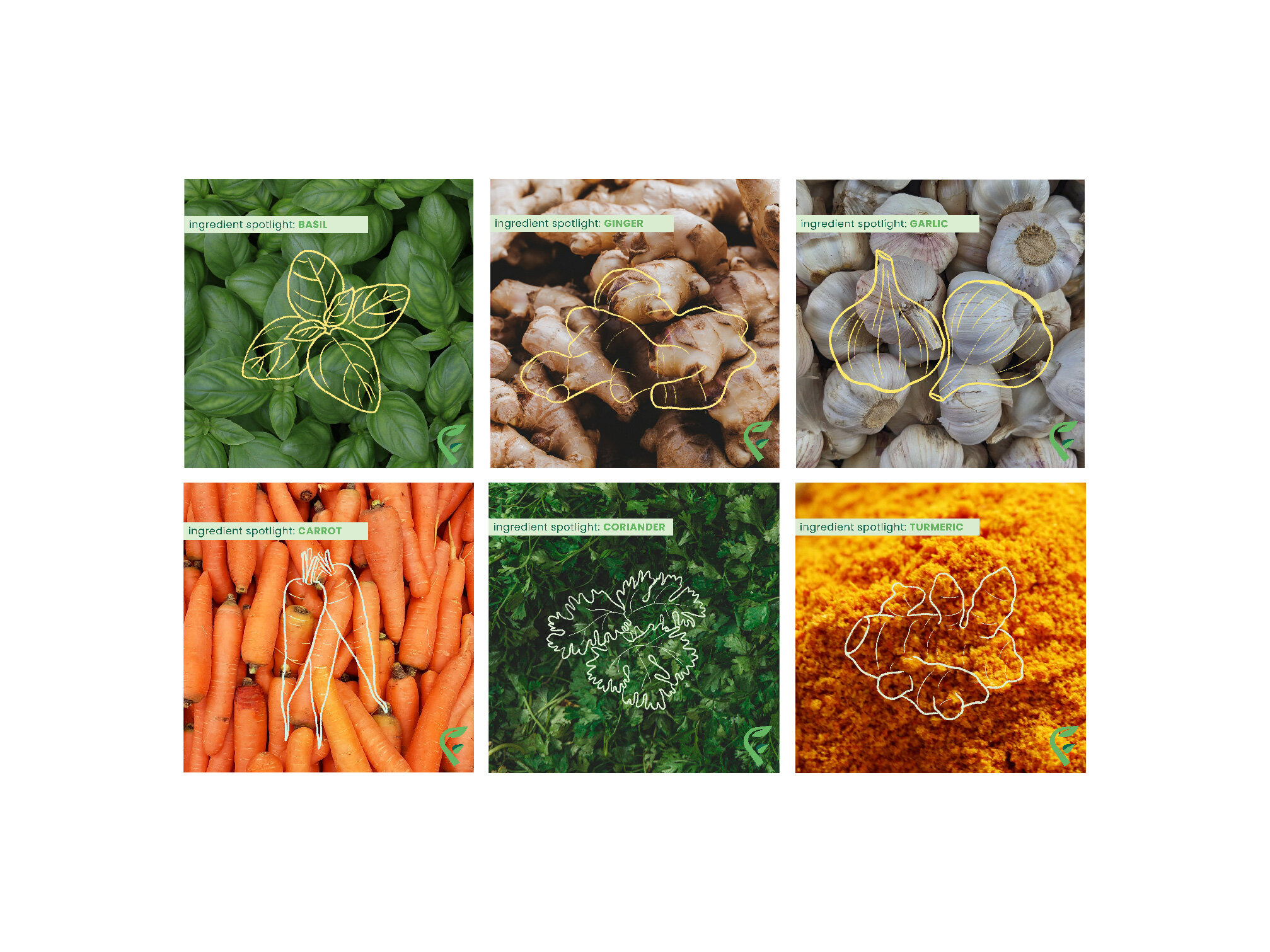
What? As a team we developed a plan to infuse the business’s warm and welcoming personality into branded assets, including a color palette and typographic pairing. I created hand-drawn illustrations of the ingredients to reflect the human-touch that goes into each meal. I reworked the language on the website to capture the business’s friendly tone. I proposed a website layout with friendly visuals and language to invite people to engage with them online. I created a label for their pre-packaged meals, a graphic to go on their smartfridges, social media posts, and a visual branding guide.
Why? Farmacy Food specializes in forming close-knit relationships with their customers in order to better guide them on the path to ultimate holistic health. They personally engage with each customer and carefully curate meals rich with nutrients and health benefits. However, their original branding felt stale, impersonal, and disconnected. I incorporated hand-drawn textured illustrations in order to capture the personal touch that goes into each product. We introduced friendly first-person language to their website to invite people into the business’s community. The old colors, green and white, did little to show the company’s fun and creative personality, so we introduced colors like “ginger yellow” and “coriander green.”
How? As a team, we spent several weeks conducting research through communications audits, competitor profiling, interviews with our stakeholder, and distributing questionnaires to current and potential customers. We educated ourselves on the current trends of the health food market and developed a plan for differentiating Farmacy Food from their competitors. We learned through surveying that potential customers perceive the current name, logo, and design choices as clinical, impersonal, and gimmicky, giving us a clear direction for our design work: to convey the ideas of human warmth and friendliness into the brand.